 RAJA
Design system · Web, iOS, Android · 2026
One design system. Every product I build next.
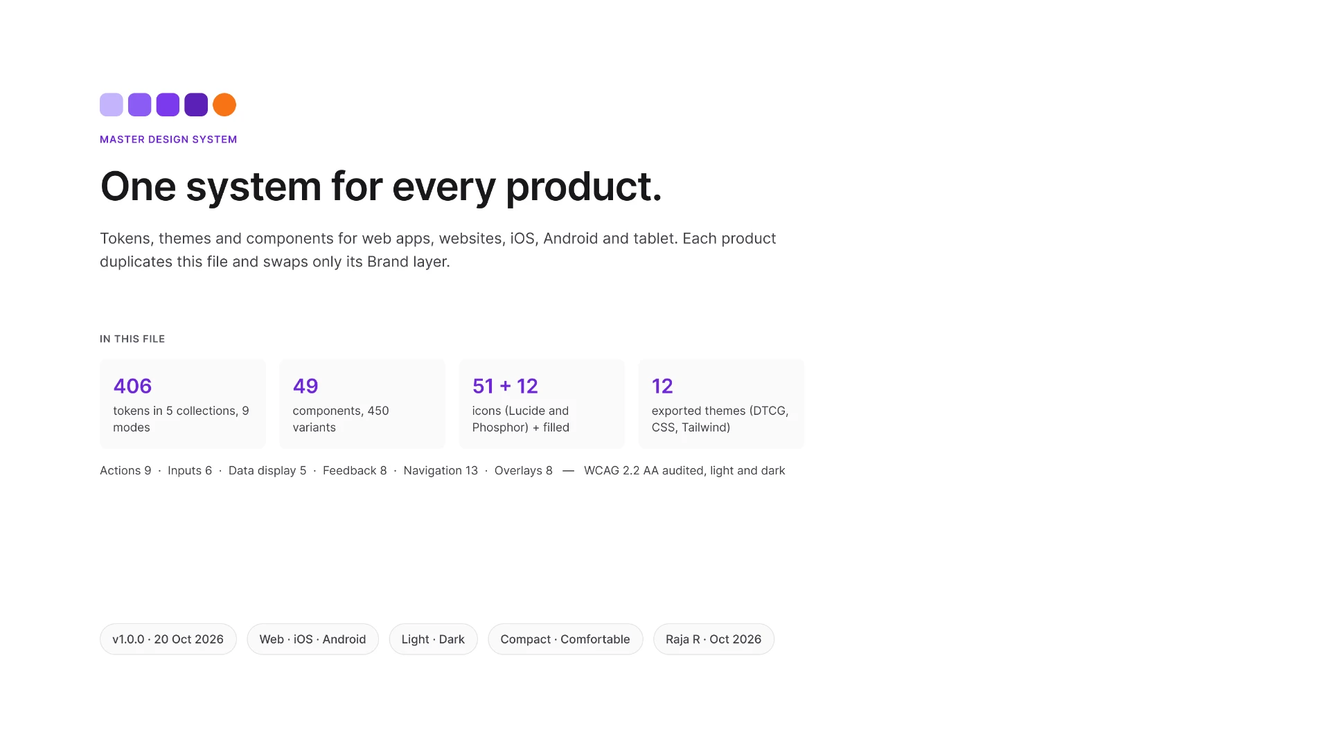
I audited two of my old design systems and rebuilt them as one master system: 406 tokens, 49 components with 450 variants, and three platforms. Every product I start now begins as a copy of it. Change one brand colour, and every component re-themes.
01 · The problem
After designing CareJourney at AI Fest 2.0, I looked at how I start every product: I duplicate an old design system and adapt it. That meant rebuilding a design system for every product.
So I audited the two systems I already had, to decide what every new product should start from.
Web App Design System
Strength: clean architecture: 4 collections, state-last names, a true 4/8 spacing scale.
Gap: only 13 components; Button had no Pressed or Loading state; no grids, focus rings or motion.
I kept: the architecture and naming.
Odin Design System v2
Strength: breadth: about 60 component pages; Button with 432 variants.
Gap: 811 paint styles duplicating variables; 105 semantic colours open to every property; spacing names that don't match their values (md = 8, lg = 10, xl = 12); separate Light and Dark ramps; web-only grids.
I kept: the coverage of components and states.
Neither system could be the master. I built a new one: Web App's architecture and Odin's coverage, rebuilt on clean tokens.
02 · Principles
I wrote ten non-negotiables before the first token. These five shaped the system most.
- Audit before merging. Nothing came across from an old system until I'd measured it.
- Semantic tokens before components. Components only use meaning-based tokens like color/action/primary/default, never raw colours.
- Accessibility is architecture. Contrast, text size and target size are set in the tokens, so every component starts compliant.
- Shared intent, platform-specific execution. One component, three platforms: a Top Bar is 56px on web, 44pt on iOS and 64dp on Android.
- No false validation claims. Results are labelled Measured, Inspected or Specified. Design-stage work isn't called tested.
The other five: no blind copying, one source of truth, no unexplained hard-coded values, approval before changes, and documentation ships with the system.
03 · Architecture
Every value lives in one of five layers, and each layer only points to the one below it. Components never hold a raw colour.
Swap the Brand layer, and every button, tab and focus ring follows.
One name everywhere: color/text/primary in Figma is var(--color-text-primary) in CSS and colorTextPrimary on iOS and Android. Every variable has explicit scopes and code syntax for three platforms, and semantic tokens are always aliases.
04 · Components
Each of the 49 components covers its full set of states, works in Light and Dark, and ships with a documentation frame: purpose, anatomy, content, states and accessibility notes.
| Group | Components | Variants |
|---|---|---|
| Actions | 9 | 162 |
| Inputs | 6 | 89 |
| Data display | 5 | 75 |
| Feedback | 8 | 38 |
| Navigation | 13 | 62 |
| Overlays | 8 | 24 |
- Selected never relies on colour alone. Every selected state also has a check, an indicator, a filled icon or a brand border.
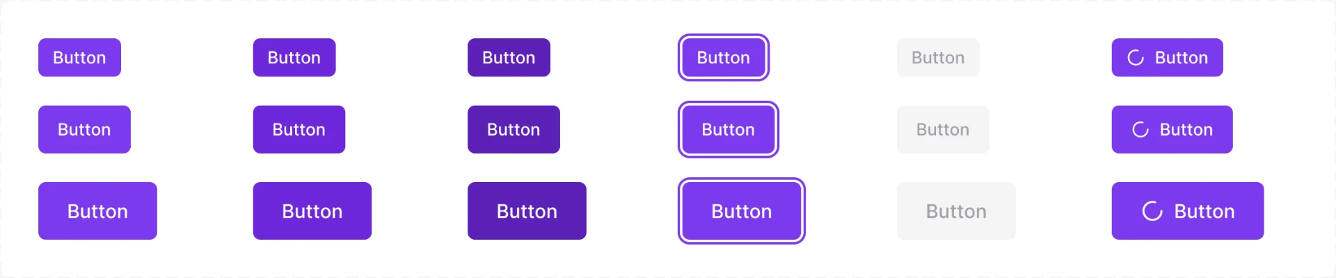
- Focus you can see. An offset ring: a 2px gap, then 2px of brand colour. 5.7:1 in Light, 7.3:1 in Dark.
- Slots, not detached copies. Cards take any content through a body slot, so nobody needs to detach an instance.
05 · Platforms
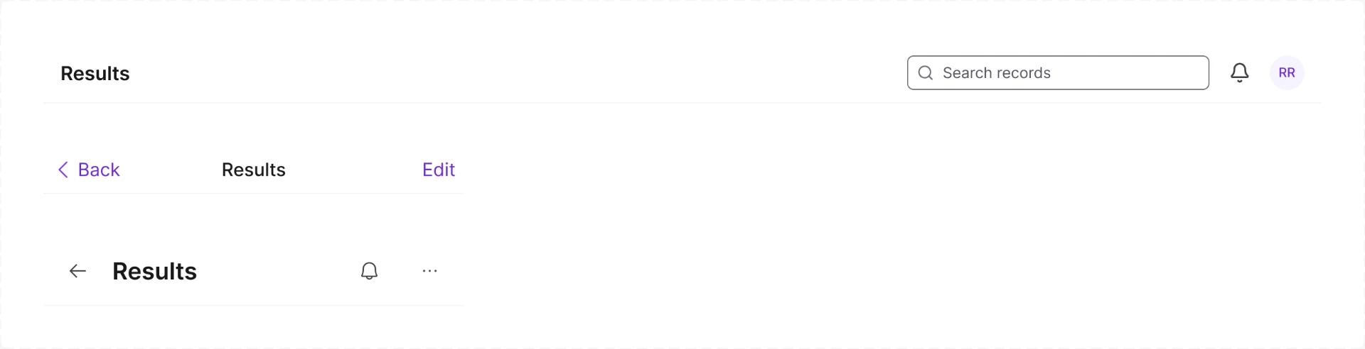
I didn't stretch a web design onto phones. Each platform gets its own sizes and conventions from the same tokens, and a platform variant measures correctly wherever it's placed.
| Component | Web | iOS | Android |
|---|---|---|---|
| Top Bar height | 56px | 44pt | 64dp |
| Tab Bar height | — | 49pt | 80dp |
| Minimum touch target | 24px | 44pt | 48dp |
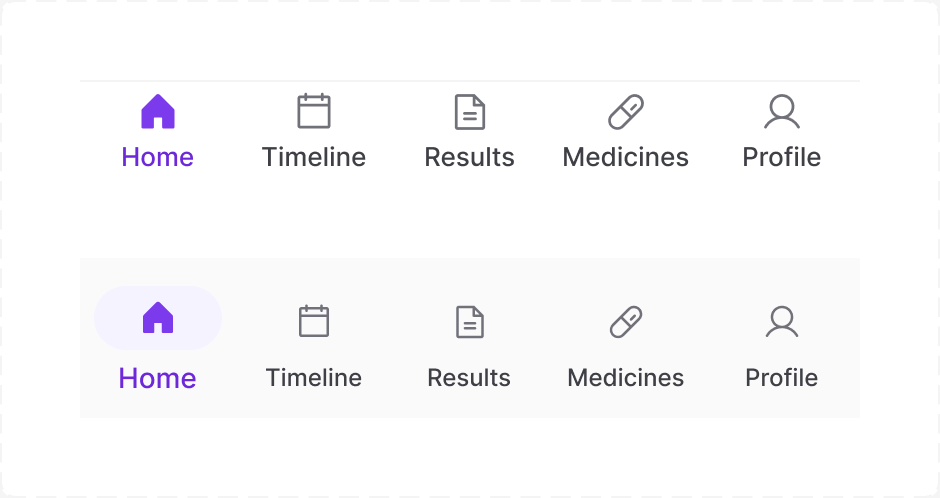
Icon rule: Lucide for web apps and dashboards; Phosphor for mobile apps and marketing sites, with the Fill weight for the selected tab. Icon names stay family-neutral (icon/<name>), so a product can switch family without renaming anything.
06 · Accessibility
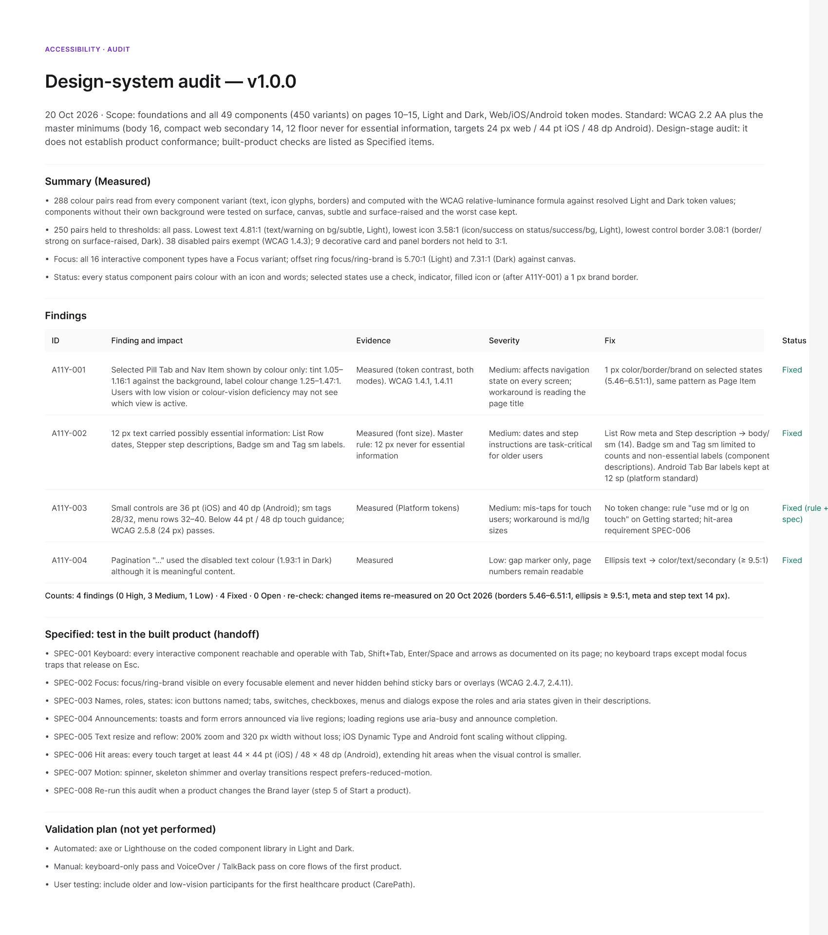
At AI Fest, I learned that passing contrast isn't the same as readable. So this audit checks text size and colour-only states, not just contrast ratios.
Minimums: body text 16, compact web secondary text 14, and 12 as a floor that never carries essential information.
- 288 colour pairs measured from every variant, in Light and Dark.
- All 250 pairs held to a threshold pass. Lowest text 4.81:1, lowest icon 3.58:1, lowest control border 3.08:1.
- 38 disabled pairs are exempt under WCAG; 9 borders are decorative.
- All 16 interactive component types have a Focus state.
| ID | Finding | Fix |
|---|---|---|
| A11Y-001 | Selected Pill Tab and Nav Item relied on a colour tint (1.05–1.16:1) | Added a 1px brand border (5.46–6.51:1) |
| A11Y-002 | 12px text carried essential information | Raised List Row dates and step descriptions to 14px |
| A11Y-003 | Small controls were below iOS 44pt and Android 48dp touch guidance | A “medium or large on touch” rule plus a hit-area spec |
| A11Y-004 | The Pagination “…” used the disabled colour (1.93:1) | Switched to secondary text |
This is a design-stage audit. Keyboard, screen reader and zoom behaviour are specified for the build and will be tested once code exists, followed by axe and Lighthouse checks, VoiceOver and TalkBack passes, and testing with older and low-vision users.
07 · Design to code
The tokens leave Figma ready to use. I exported every variable as DTCG JSON, then built CSS variables, a Tailwind preset and resolved theme files with Style Dictionary.
Style Dictionary built all 12 themes, 429 tokens each, with 0 unresolved references. Broken references are set to fail the build.
<button class="bg-action-primary-default rounded-control h-control-md">Book visit</button>08 · How I build
I used Claude connected to Figma, and treated it like a fast, careful team member: I set the rules, it built in the file, and nothing moved forward without my approval.
- Rules first. I wrote my design-system process as reusable skills: setup steps, naming rules and the accessibility audit.
- Audit before building. Claude measured both old systems; I decided what to keep, rebuild and drop.
- Approval gates. Every stage was proposed, reviewed and approved by me before it changed the file.
- Measure, don't trust. Audits caught raw values where tokens should be, and they were rebound to semantic tokens.
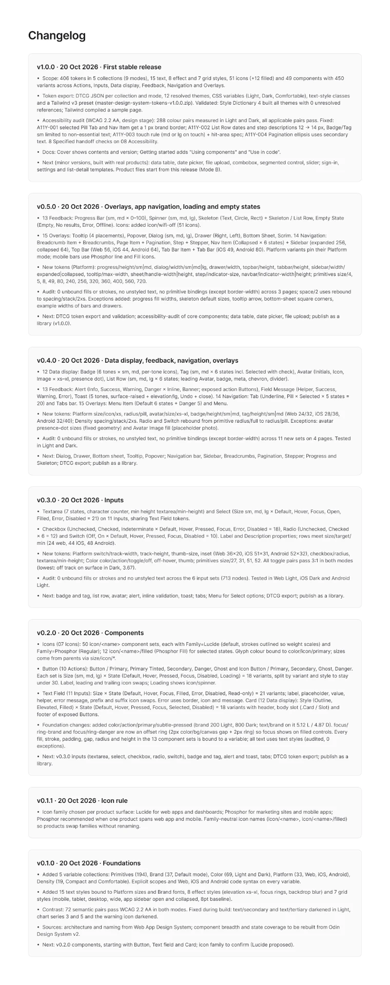
- Log everything. Every change went into the Changelog with a version number.
Foundations to v1.0.0 took one working day, 20 October 2026. The speed came from the AI; the quality came from the rules and the gates.
| Version | What shipped |
|---|---|
| v1.0.0 | Token export and validation, accessibility audit and fixes |
| v0.5.0 | Feedback, overlays and navigation, including platform bars |
| v0.4.0 | Badge, Tag, Avatar, List Row, Alert, Toast, Tabs, Menu |
| v0.3.0 | Textarea, Select, Checkbox, Radio, Switch |
| v0.2.0 | 50 icons, Button, Icon Button, Text Field, Card, focus ring |
| v0.1.1 | Icon rule |
| v0.1.0 | Foundations: 5 token collections, styles, 72 colour pairs passing AA |
Three things the build taught me:
- A shadow-based focus ring didn't render until the frame clipped its content and had a fill.
- One text property on a component set overwrote every variant's sample copy, so every alert read “Title”. Some components now deliberately skip text properties.
- One icon-swap property forced the same icon onto every badge tone, so each tone got its own fixed icon.
09 · What's next
Every product I start now begins as a copy of this file, starting with CareJourney. Data tables, date pickers and form patterns will arrive when a real product needs them, not before.
A few values stay fixed on purpose, like 1px dividers, avatar presence dots and the tooltip arrow. Each one is listed in the file with its reason.