 RAJA
Consumer · iOS, Android, iPad · 2020–2022
Designing a dating app built on trust, not swipes
PAVO is a US dating app where people meet through short videos, verified profiles and a map of who's nearby, instead of swiping. I led the product design across iPhone, Android and iPad, refined it through three rounds of testing and our own product data, and set up the UI sign-off that took it to launch on the App Store and Google Play in 2022.
01 · The product
PAVO's founders wanted a dating app that fixes what people dislike about swiping: fake profiles, endless browsing and conversations that go nowhere. Their answer was a set of features no competitor had together: a Trust Score built from ID and selfie verification, a map "beacon" that shows who's nearby, short video answers instead of a text bio, and Ghost Mode for people who want to stay hidden.
My job was to turn those ideas into one clear app across iPhone, Android and iPad, and to keep the design intact all the way to release.
02 · Making trust visible
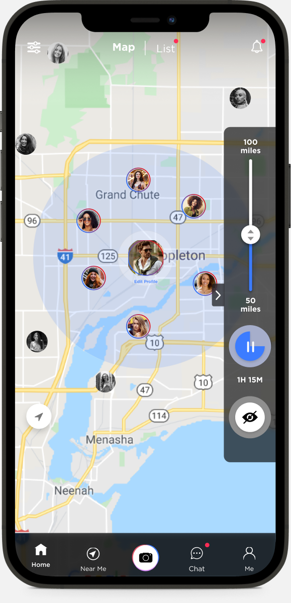
Trust was the product's main promise, so it had to be obvious on every profile. I designed the Trust Score as a single number in a ring, shown next to age and height, and a screen that explains exactly how to raise it: government ID for 100 points, a selfie for 60, social accounts for 10–50. Every option says what is shared and what stays private.
03 · Video before photos
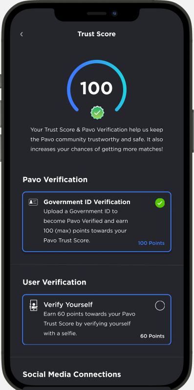
To replace the photo-and-bio pattern, profiles lead with short video answers to questions like "What's your biggest fear?". Each answer has its own like and reply, so a conversation can start from something the person actually said.
04 · Fixing onboarding through three test rounds
There was no formal user research on this project, but the app went through three internal test rounds with the QA team and a working session with the client, January to April 2021. One problem came up every time:
- Round 1: testers said new users didn't know how to finish their profile. I designed a profile walkthrough and short in-context tutorials.
- Client session: the intro videos slowed people down. We removed them and added swipe between screens.
- Round 2: the intro images looked blurry and "gave a low quality feeling" on first launch.
- Round 3: still blurry on some devices, and people wanted to skip. We added a Skip option, and I reviewed the walkthrough images for sharpness.
The lesson: the first 30 seconds set people's opinion of the whole app, so onboarding quality got the same review as the main screens.
05 · The pricing screen
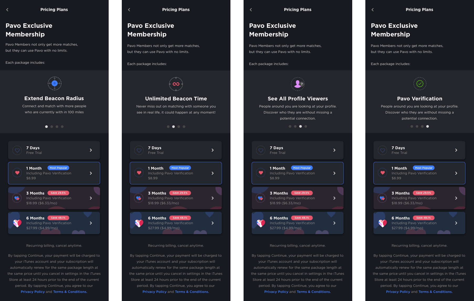
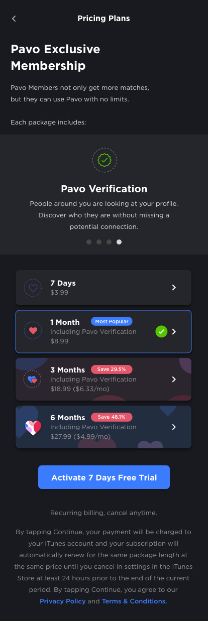
The paid plan unlocks features like a wider beacon radius and seeing who viewed you. I designed the pricing screen to change with the feature that brought someone there: tap a locked radius and the screen leads with "Extend Beacon Radius". A later version pre-selected the most popular plan and gave the page one clear button, "Activate 7 Days Free Trial", instead of four equal rows.
06 · Using product data
During the beta I set up Mixpanel reports to see where people got stuck. Most users in the beta were testers, so the numbers were small, but they pointed at two real problems.
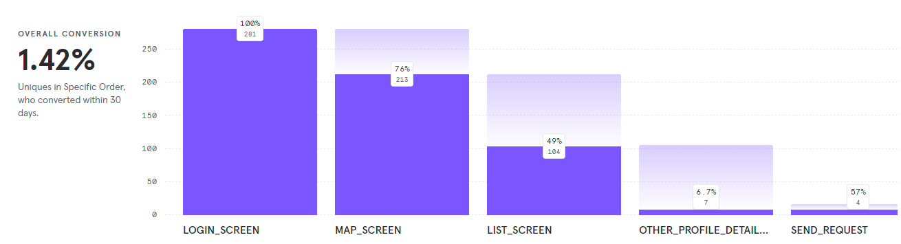
Nobody opened profiles. The funnel from login to sending a match request showed that 76% reached the map and 49% the list of nearby people, but only 6.7% of those opened anyone's profile. People could see who was nearby, but the list gave them no reason to look closer. I redesigned it to show profiles in a sliding card format, so people browse nearby profiles one at a time instead of scanning a plain list.
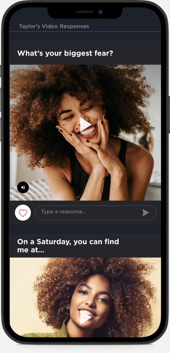
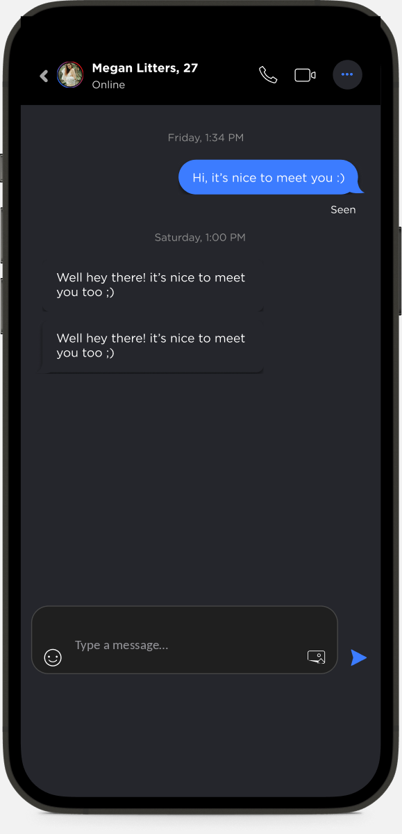
Conversations were hard to find. In a test round, testers asked for new matches to be separated from ongoing chats. I redesigned the chat list to do that. After it launched in May 2021, visits to conversations rose from 0.07 to 0.18 per user per day over the next two weeks. The sample was small and mostly testers, so I read it as a clear direction rather than a final result.
07 · Keeping the design intact to launch
With a team of iOS and Android developers building in parallel, small differences pile up fast. I set up a screen-by-screen UI sign-off process: the junior designer I mentored compared every build with the designs and logged each difference as a ticket with a screenshot, assigned to the right developer. Over 200 sign-off issues were logged and closed between February and May 2021, alongside about 1,000 tracked issues from QA.
08 · Beyond the app
I also designed the investor deck (12+ versions in 2021), the website, app store screenshots, and an explainer video in After Effects. For the launch film, I designed the app screens shown in it.
PAVO launched on the App Store and Google Play in 2022 and has since been taken down.
09 · What I'd do differently
Our feedback came from testers and the client, not from the people PAVO was built for. Next time I'd put the onboarding and the Trust Score in front of five people from the target market before the first test round, and agree on success measures like profile completion and trial starts before launch. The beta data helped, but it came mostly from testers; I'd want the same reports from real users in the first month after launch.