 RAJA
Healthcare · Web App · 2026
Designing the next step for people managing diabetes
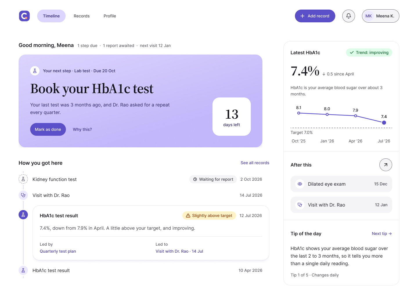
CareJourney is a web app that turns a patient's prescriptions, lab reports and doctor's instructions into one linked timeline, with a single card that says what to do next and why. I designed it with two teammates in six days at AI Fest 2.0, where I won Best Individual and our team won Best Team.
Best Individual · Best Team · Team ranked 2nd — AI Fest 2.0
01 · The problem
People with diabetes follow a care plan for years: daily medicines, a blood test every three to six months, and yearly eye, kidney and foot checks, often with different doctors. In India, much of this arrives on paper or by word of mouth.
The brief asked for one place where a patient can see their whole care journey and know the next important action, without building a full healthcare platform.
02 · What I needed to find out
We had six days and no access to patients, so I chose secondary research and was clear about its limits. Before searching, we wrote down 12 assumptions and ranked each by how much it would hurt if we were wrong.
The riskiest were: patients struggle because information is scattered, not because they lack motivation; older patients will use an app regularly; and patients will trust an app with their medical history.
03 · What the evidence showed
We checked the assumptions against 10 published studies and the apps patients already use.
- The patient is the only link between doctors. In a study of 513 outpatients in Kerala and Himachal Pradesh, only 24% of clinic documents held diagnosis, medicines, long-term care and follow-up together.
- Most care isn't working. Fewer than 8% of people with diagnosed diabetes in India meet blood sugar, blood pressure and cholesterol targets together.
- Seeing a result isn't understanding it. Patients underestimated the need to act on lab results, even when abnormal values were highlighted.
- Simplicity and trust decide adoption. For older adults, digital literacy, usability and mistrust are the main barriers.
Two assumptions held. Two moved to at risk: regular app use, and trust. That changed the design brief: the product had to be very simple, and the patient had to approve every piece of data.
"Patients don't lack reminders. They lack a connected picture that tells them what matters next."
04 · Key decisions
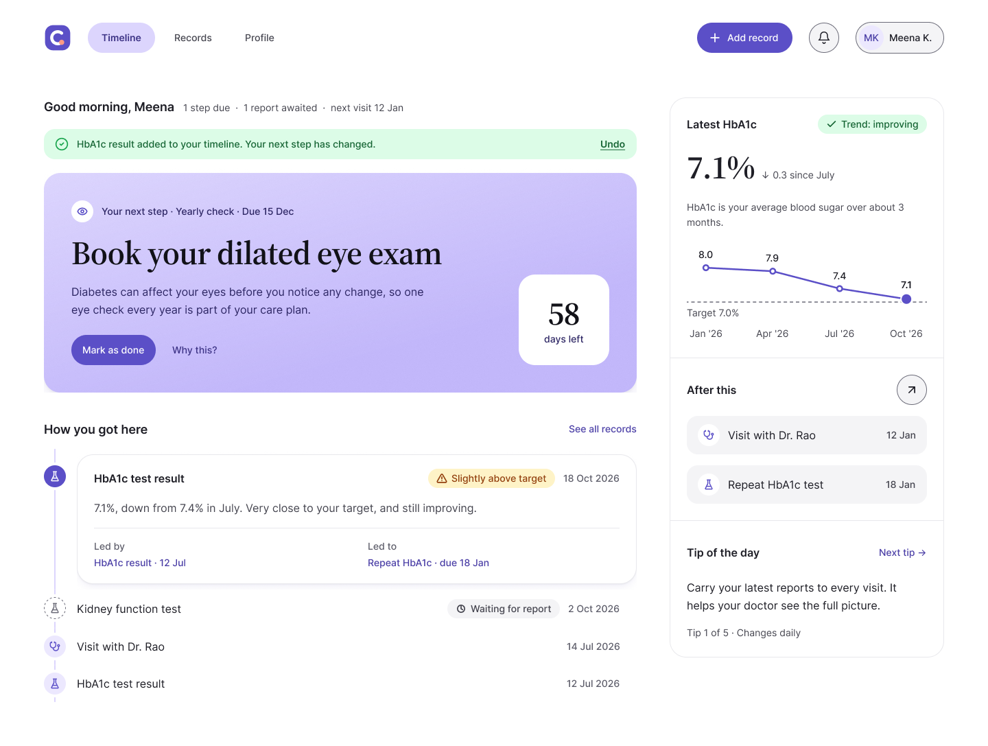
One next step, not a to-do list. The home screen shows a single "Do this next" card with the action, the reason and the date. I wrote a ranking rule so the card is predictable: overdue tasks first, then dated tasks from the patient's own records, then the standard diabetes care plan. Daily medicines stay on the timeline and never take the card, so it stays meaningful.
Show what led to what. Every timeline item shows what caused it and what it led to. A high HbA1c result creates a follow-up test, and the test shows the result behind it. No app we reviewed did this; they store records or send reminders.
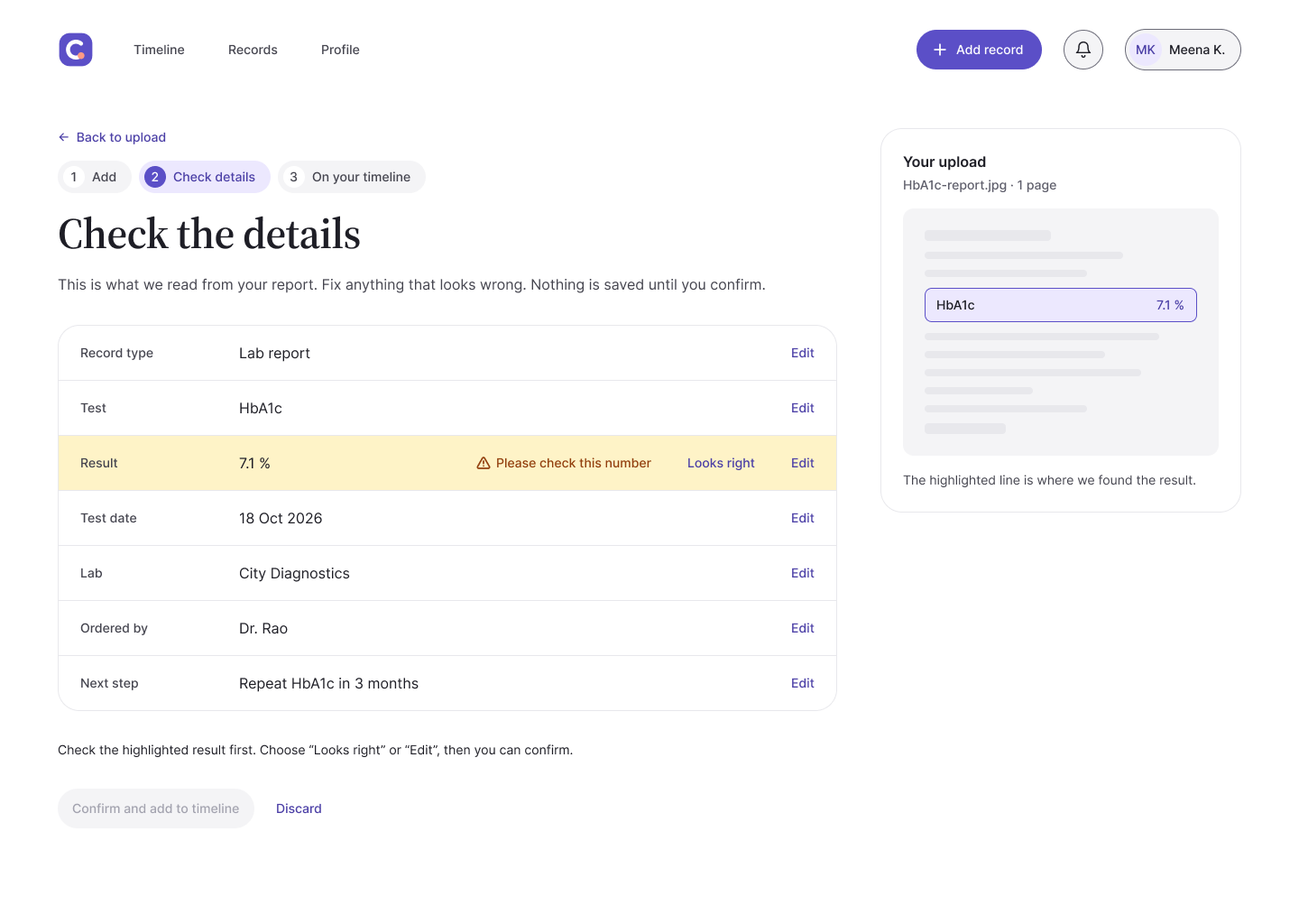
Nothing is saved until the patient confirms. Records are added by photo, and the app reads the details. Because trust was an at-risk assumption, every detail is shown beside the original photo for the patient to check before it reaches the timeline.
Useful from day one. An empty timeline is worthless, so a short care profile and a ready-made yearly diabetes plan fill it on the first visit.
05 · The design
The product does one job, so colour does one job. The "Calm violet" system keeps everything neutral except the lilac next-action card, so it's the first thing a patient sees. Results always come with a plain-words status, and status never relies on colour alone.
I built the system as Figma variables in three layers, primitives, semantic tokens and components, with light and dark modes. Five product components carry the core journey: next-action card, timeline item, result summary, upload area and confirm-detail row.
06 · Review: the surprise that changed the design
In a peer review, other teams said the screens had "low contrast". I measured every text layer: all of it passed WCAG's 4.5:1. The real problem was text at 12–13px in capitals and very pale shapes, such as chart bars at 1.4:1.
A full WCAG 2.2 AA and heuristic review found 18 issues; we fixed 17. The most serious: the Confirm button worked even when the app wasn't sure it had read a lab value correctly. A misread number could be saved and drive the wrong next step. Confirm now stays off until the patient checks that value.
| Measure | Before | After |
|---|---|---|
| Smallest text | 12px | 14px |
| Chart contrast | 1.4:1 | 6.2:1 |
| Smallest tap target | 26 × 20px | 44 × 44px |
| Screens with loading or error states | 0 | 2 |
07 · What I'd do next
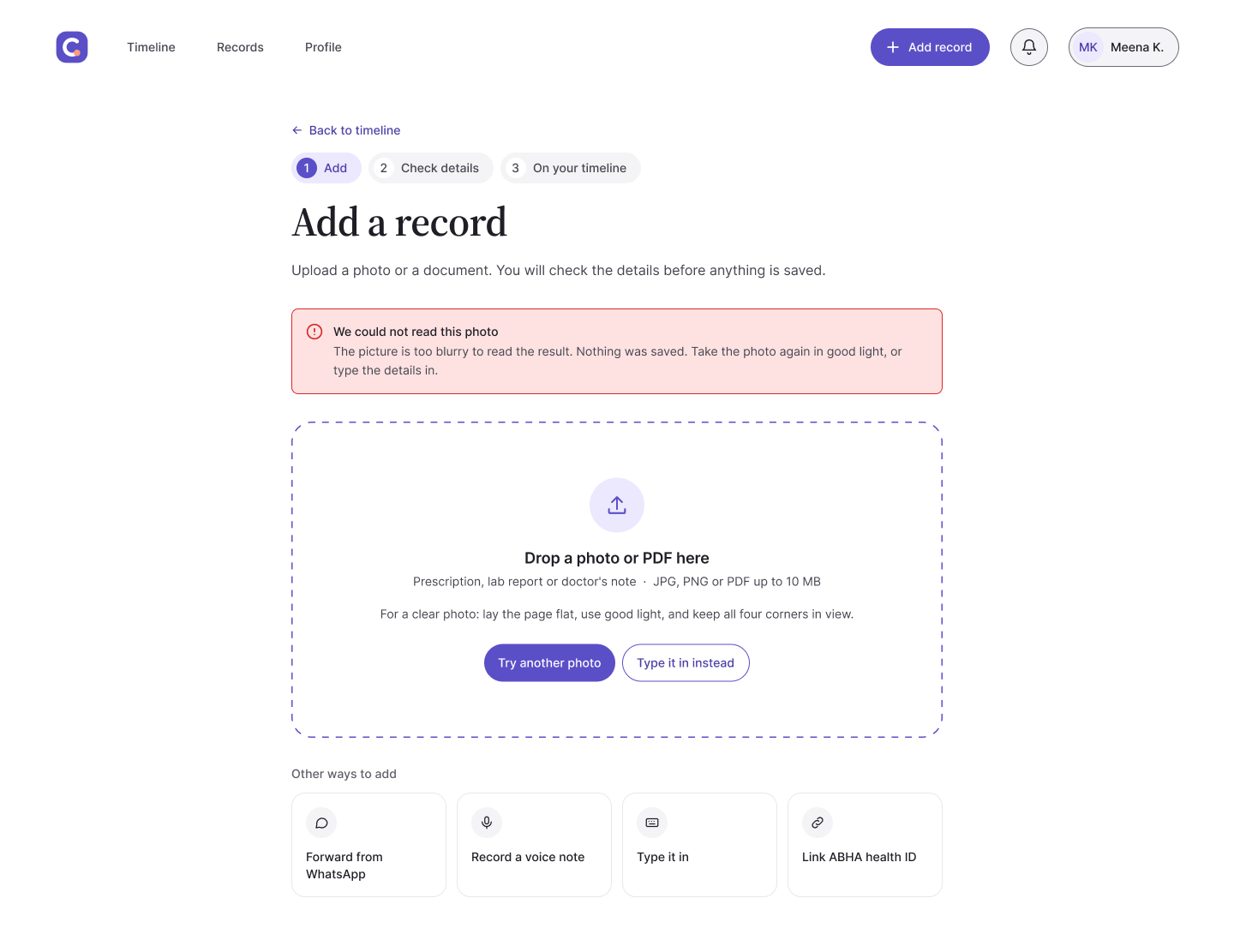
This was secondary research and peer review, not testing with patients. With more time, I'd put the next-action card in front of five people managing diabetes first: do they trust the ranking, and do they act on it? I'd also test photo capture with real paper reports, since that's where the design is most likely to fail.
The biggest lesson: passing a contrast check isn't the same as being readable. Text size, tap size and shape contrast now go into the design system on day one.